Office
Conexus Credit Union Head Office
LocationRegina, Saskatchewan
CompletionFall 2020
Overview
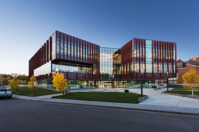
This project is a key component in the revitalization of College Avenue Campus including Darke Hall. The new 80,000 square foot head office for Conexus Credit Union is contemporary and “of its time” while drawing inspiration from the historic collegiate gothic buildings of the University of Regina’s original campus. The building provides a new accessible lobby for Darke Hall, a leading-edge business incubator, a public three storey atrium, and a public coffee shop. Park users can enjoy a new exterior courtyard along with the other amenities.
Awards
2022 Gold MASI Award
2021 Premier’s Award of Excellence in Design in Architecture
Sherwood Place
LocationRegina, SK
Completion2020
Overview
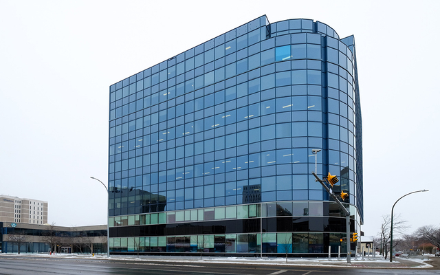
Sherwood Place is an existing 9-storey tower undergoing a full base building renovation. The multi-phase project includes expansion of the ground and second floors to create additional leasable area, parkade expansion, landscaping, modernization of elevator lobbies, mechanical and electrical upgrades, washroom renovations, and a relocated/redesigned main entrance.
Colliers Project Leaders Regina Corporate Office
LocationRegina, SK
Completion2018
Overview
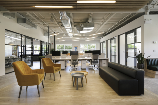
Colliers Project Leaders’ relocated corporate office implemented company standards and branding into a new open office concept with a focus on reconfigurable workstations and a flexible work environment. The project achieved this by opening the floor plate, standardizing and lowering the furniture, and including only critical support spaces to allow a variety of work functions and tasks to take place at various locations throughout the office. The result is an inviting, light-filled, modern, flexible space for both the users and their clients.
Kanuka Thuringer
LocationRegina, SK
Completion2018
Overview
Previously located across four floors, Kanuka Thuringer’s client meeting rooms, boardrooms and reception were consolidated onto one floor. The design modernized the space with a timeless material palette and the latest technology.
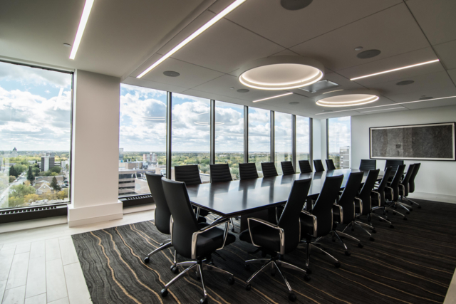
The design took advantage of the view towards Wascana Park and the Legislative Building. Using a wall of glass between the boardroom and the reception area allows this view to impact everyone that enters the firm. The colours in the marble reception desk are carried through all the materials and furniture selected. P3A also incorporated the existing dark mahogany by adding a wood room that sits in the middle of the reception floor.
The crisp white drywall, grey back-painted glass, dark wood and simple stone flooring create a timeless back drop for the firm’s art collection.
Alvin Hamilton Building
LocationRegina, Saskatchewan
Completion2006 & Ongoing
Overview
The Alvin Hamilton Building underwent a $21 million retrofit of the 260,000 square foot Galleria Shopping Mall. The re-design was completed in 2006 by P3A. In 2017, renovations began on all 80,000 square feet to bring the spaces up to Government of Canada Workplace 2.0 standards. The project involved programmatic requirements for three different Government of Canada departments - Health Canada, Environment Canada, and Employment and Social Development Canada. The plan centres around the reorganization of 223 full time equivalents (FTE) in the building and bringing 270 additional FTE’s into the building.
Lecture Theatre
LocationRegina, Saskatchewan
Completion2016
Overview
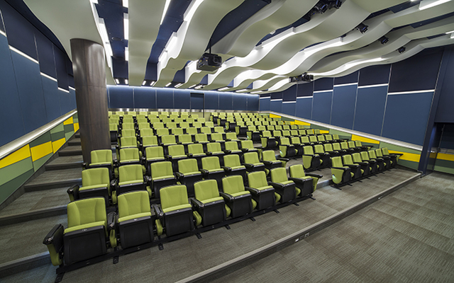
The dramatic, multi-purpose lecture and presentation space was created for a corporate client. Seating between 150 to 200 people, the design takes inspiration from the client’s brand and the Canadian landscape including the sense of horizon, planted fields and dramatic skies. The theatre improves access to training sessions, meetings and presentations, complete with excellent acoustics and technology that supports those functions. The theatre integrates a sophisticated distance learning system, and extensive lighting controls that can mimic natural lighting conditions at different times of the day. The signature space showcases the client as enduring, professional, accessible, and innovative.
Miller Thomson Lawyers
LocationRegina, Saskatchewan
Completion2014
Overview
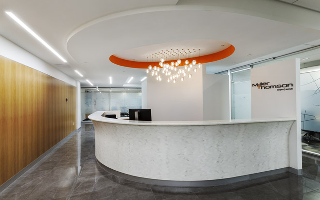
The design of Miller Thomson’s office involved renovating the existing space as well as adding a new floor. The project aimed to amalgamate the disbursed staff, create a local identity for the firm that reflected the national brand, provide flexible meeting spaces, and develop a modern interior to reflect both the history of the firm and its evolution.
The project included the complex insertion of a new stair link which was also used as a signature sculptural element. Other features included glass-fronted meeting rooms that deliver natural light, a moveable glass wall and custom wood sheathed pocket doors. These elements transform the staff lounge, library, principal boardroom and reception into a dramatic and flexible gathering space.
MLT Aikins LLP
LocationSaskatoon, Saskatchewan
Completion2014
Overview
The redesign of MLT Aikins' Saskatoon office involved renovations over four floors. Along with the addition of space and a need to create more meeting space, MLT wanted to rebrand so the space reflected their status as one of the top law firms in Western Canada. A rich, neutral palette of materials was used to create a warm, bright, inviting space and exclusive pieces of art were added to create bold visuals.
Cypress Hills Administration Centre
LocationCypress Hills Interprovincial Park, Saskatchewan
Completion2014
Overview
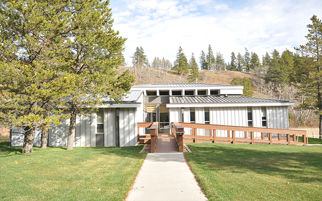
The Cypress Hills Administration Centre celebrates Saskatchewan Parks’ approach to resource management and the natural landscape.
The design repurposed the existing visitor centre with the aim of supporting sustainable practices and environmental preservation and enhancing the quality of life for staff. The result was significant cost savings and renovations that breathed new life into the building, including much-improved energy efficiency and ventilation, and more daylight pouring into the heart of the interior.
Graham Construction Ltd. Regina District Head Office
LocationRegina, Saskatchewan
Completion2012
Overview
The Graham Construction Head Office is a great example of how a design can support and enhance the business of a client. The goal of the concept was to demonstrate the “master builder” status of the client through the expression of traditional building materials. The well-tailored and understated exterior draws on the Graham corporate colours and the dolomite wall was constructed from stone from Graham’s own Saskatchewan quarry.
The interior is a flexible arrangement of offices and workstations organized as a “race-track” around the central atrium to encourage collaboration and instill a cooperative team environment.
The building distinguishes itself as a showpiece that reflects the client’s business.
Atrium Building Lounge
LocationSaskatoon, Saskatchewan
Completion2012
Overview
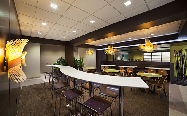
The project at Innovation Place entailed a series of renovations within the Atrium Building to create a cohesive and upgraded aesthetic for public spaces. Inspired by the existing coy pond, the design scheme became subtly infused with Japanese elements.
The existing lounge was redesigned into a warm, appealing space through the use of bamboo, dark brown leathers, green table tops, a backlit shoji wall and paper lanterns. Different types of seating was introduced to allow for quiet breaks, small meetings and functions.
The shoji-style sliding doors act as a continuation of the atrium when open, while also providing an appropriate acoustic barrier between the two spaces when closed.
P3A Studio
LocationRegina, Saskatchewan
Completion2011
Overview
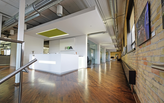
Transforming the second floor of a 1926 warehouse from a billiards hall to an office and design space offered P3A more space and an opportunity to express the firm’s philosophy and culture.
Perimeter walls were left exposed to emphasize the texture of the original brick and hardwood floors, with white walls and blocks of colour integrated throughout. The office includes flexible meeting and social areas with transparent north and south walls that connect to the open studio space. The transparency allows daylight to penetrate into the office and provides dynamic views.
Without compromising the building’s historical exterior, the windows along the north and west walls were extended to increase natural light and afford views of the prairie sky.
City of Regina Asset Management Office
LocationRegina, Saskatchewan
Completion2009
Overview
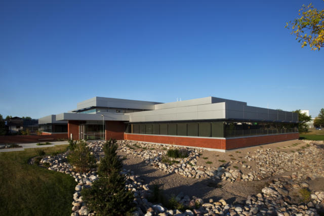
With high levels of energy efficiency, natural lighting, recycled materials, and excellent indoor air quality, this building provides an inspiring and healthy office environment for City of Regina staff.
The exterior red brick and aluminum was selected to harmonize with the adjacent storage building, which is a 1950’s era former Chrysler manufacturing plant. Open workstations replaced typical offices, allowing for a flexible interior space that permits easy changeability.
The Terrace Building
LocationInnovation Place, Regina, Saskatchewan
Completion2002
Overview
Internationally recognized for its design, the Terrace is a multi-tenant, state-of-the-art information technology building. It is one of the most energy efficient buildings in Canada and was completed years before sustainable design became adopted in the industry. The project set a precedent for sustainability and has influenced the design of a number of buildings.
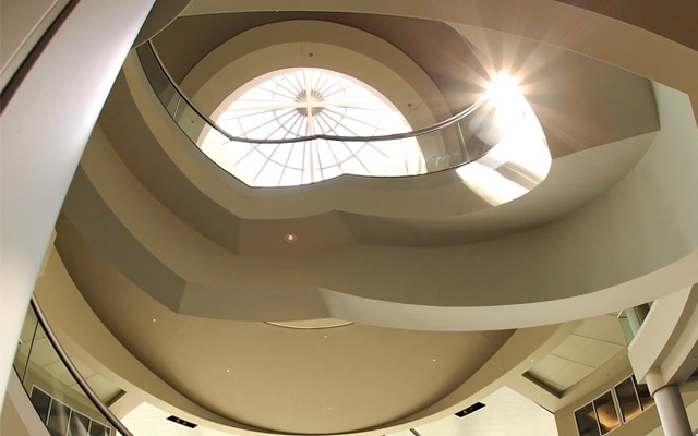
The rotunda is capped with a 10 metre round skylight which acts as a solar ‘chimney’. The space is very popular for events which demonstrates the flexibility and resiliency of the design.
Awards
2003 NRCan Energy Efficiency Award
Ascent Strategy
LocationRegina, SK
Completion2024
Overview
This project was a tenant improvement at Ascent Strategy, nestled in Regina’s Cathedral neighbourhood. P3A collaborated with the client and Innova Developments, with innovative solutions that blended functionality and style. The space boasts a sleek boardroom, a variety of private meeting spaces, and a sunlit office integrated within an open office layout. The lounge area is a retreat adjacent to the airy kitchen, grounded in earth tone hues.
MLT Aikins
LocationRegina, SK
Completion2023
Overview
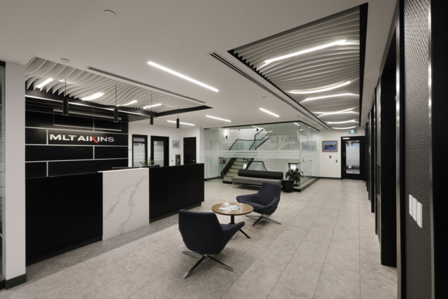
P3A was tasked with restacking and redesigning four floors of office space for MLT Aikins to improve productivity and functionality and to create a consistent aesthetic. Sustainable design elements were incorporated, including updating the existing fluorescent lighting with LED and introducing more natural light by replacing solid walls with glass around perimeter offices and boardrooms. The existing doors and frames were repurposed, and the existing workstations were reused.
Contrast was incorporated by creating a monochromatic colour palette to emphasize the client’s extensive art collection. The variety of materials and textures added interest, including tile, carpet, ceiling baffles, and wood veneer panels installed in a stacked linear pattern.
P3A Head Office
LocationRegina, SK
Completion2023
Overview
The move to our own building in downtown Regina marked another major milestone in P3A’s evolution. In a nice coincidence, the building was originally designed by Joseph Pettick who founded P3A 70 years ago.
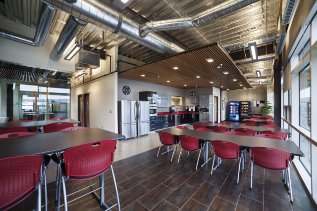
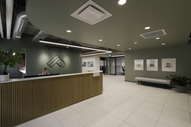
The project involved a full interior demolition and renovation to two levels of the 1978 office building. Spaces include a reception area, boardrooms, a staff lounge and kitchen, an in-house IT area, open office space, individual office configurations, quiet rooms, locker room, library, and collaboration spaces. Interior finishes were selected to enhance a comfortable work environment through an earth tone colour palette, natural woods, and tile patterns that mimic stone. Furniture selection focused on flexibility, organic layouts, durability, and creating modern seating options to allow staff to work in unique settings.

